
Search for Indicators
Disparities Dashboard
Indicator Gauge Icon Legend
Legend Colors
Red is bad, green is good, blue is not statistically different/neutral.
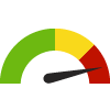
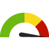
Compared to Distribution
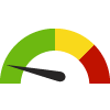 the value is in the best half of communities.
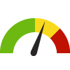 the value is in the 2nd worst quarter of communities.
 the value is in the worst quarter of communities.
Compared to Target
 meets target;
  does not meet target.
Compared to a Single Value
 lower than the comparison value;
 higher than the comparison value;
 not statistically different from comparison value.
Trend

 non-significant change over time;
 significant change over time;
  no change over time.
Compared to Prior Value
 higher than the previous measurement period;
 lower than the previous measurement period;
 no statistically different change from previous measurement period.
 Significantly better than the overall value
 Significantly worse than the overall value
 Significantly different than the overall value
 No significant difference with the overall value
 No data on significance available
Census Place: Home Garden
Economy / Housing & Homes
Value
Compared to:
Census Place: Home Garden Overcrowded Households
Census Place: Home Garden Overcrowded Households
19.8%
(2018-2022)
Compared to:

CA Census Places
The distribution is based on data from 1,480 locales.
Kings, CA County Value
(8.3%)
The regional value is compared to the Kings County value.
CA Value
(8.2%)
The regional value is compared to the California state value.
US Value
(3.4%)
The regional value is compared to the national value.
